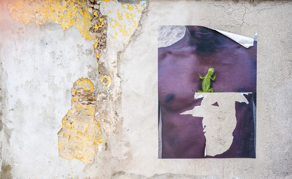
I didn’t alter the composition at all. Well, maybe the colors—I touched those up a bit. And the contours, just a little. But the composition, I left it as it was. I find it beautifully balanced. The male figure with the lizard on the faded poster on the right, and the wall with shades of gray, yellow, and light blue on the other side. Everything just works! What a beautiful gift from the elements and chance. No need to change a thing, just print it large.

